This methods post will describe in more detail how I developed the analysis behind today’s article on residential segregation and moving violations in D.C. (Predominately black neighborhoods in D.C. bear the brunt of automated traffic enforcement)
Overview
In order to understand the role that racial geography plays in traffic enforcement, I first had define a metric to quantify segregation. Then, I computed several quantities within census tracts by level of segregation, such as the number of moving violations and the sum of fines issued. Finally, I computed the sum of traffic collisions within each area as an additional check on the relative issuance of citations across the different tracts.
Demographics
The article was initially defined quite broadly. My goal was to investigate the relationship between moving violations, crashes, and socioeconomic factors, premised on a familiarity with the deeply segregated geography of Washington, D.C. Given the extremely racialized nature of wealth disparity in the District, I chose to focus the analysis on race, and included its connections with wealth narratively, rather than analytically.
Many metrics for quantifying racial segregation have been used in research, including various indices of isolation. However, the purpose of these metrics is usually to aggregate the racial composition of subareas into a single value which can be compared across different cities; the constituent values for these metrics are not sufficiently meaningful to compare the degree of segregation from one tract to the next. For this reason, I chose to classify the tracts based on simple percentages of racial composition based on the 2016 5-Year Estimates of the American Community Survey (ACS)1 at the census tract level. This approach had the added benefit of being more simple and intuitive than other methods.
Initially, I conducted the analysis at the block group level, which amalgamates census blocks (the smallest unit of analysis), since it was the most granular level at which this information was available. However, in a relatively densely populated city like D.C., census tracts were nearly identical to census blocks, and more widely understood as a unit of analysis. Again, it was another opportunity to shed complexity unnecessary to the scope of this article. Considering that nearly 90 percent of Washington residents identify as either “White Alone” or “Black Alone,” I chose to focus my analysis on these groups specifically. This analysis does not include Hispanic origin in the segregation analysis. Within this dataset, 10.5 percent of all D.C. residents identify as Hispanic in a question separate from the “race” categorization (“White,” “Black or African American,” “American Indian and Alaska Native,” “Asian,” “Native Hawaiian and Other Pacific Islander,” and “Two or more races.”)
I labelled tracts comprised of over 80 percent black or white residents “segregated,” and further define ranges of 60-80 percent composition of for both black and white residents; all remaining tracts are labelled “diverse.” Each of these categories represents roughly one-fifth of the population, ranging between 15 percent and 27 percent. Although these are not true quintiles, I believe that subdividing racial composition into these five categories provides a good balance, distinguishing the racial characteristics of each tract without excessively parsing it. From a citywide perspective, 34 percent of white residents live in white-segregated tracts, while 52 percent of black residents live in black-segregated tracts. Conversely, only 2 percent of the city’s black population lives in white-segregated tracts, and vice versa. For the purposes of this comparison, I believe that these categories fairly capture the relation between racial demographics and the traffic citations issued in each tract. Implicit in these categories is the total population, which I use to normalize the other variables for comparison.
Traffic
As a sanity check, I felt it important to ensure that there were no other gross disparities that could account for the disparity between moving violations in each census tract. One would expect that camera violations would coincide specifically with more dangerous, crash-prone locations, and broadly, with high traffic volume locations. In other words, it would make sense for areas with more traffic volume to incur a greater number of fines, and especially so if these cameras were deployed with an eye towards crash hotspots.
I checked the number of crashes per capita within each census tract, under the assumption that crashes should be roughly proportional to the population. Before doing this however, I first investigated the correlation between various subpopulations of crashes with moving violations, including minor injury crashes, major injury crashes, fatal crashes, and major injury plus fatal crashes. Seeing that the correlations were all very similar, I opted to use all available data. This stood to reason in light of the risk analysis concept of the incident pyramid, which posits that a large pool of lower level incidents (e.g., non-injury and property damage only crashes) will be roughly proportional to subsequently higher degrees of severity (e.g., minor injury crashes, major injury crashes, and fatal crashes.) In light of this, I opted to the keep the dataset as robust as possible by including all crashes, which given the law of large numbers should better identify more and less dangerous tracts.
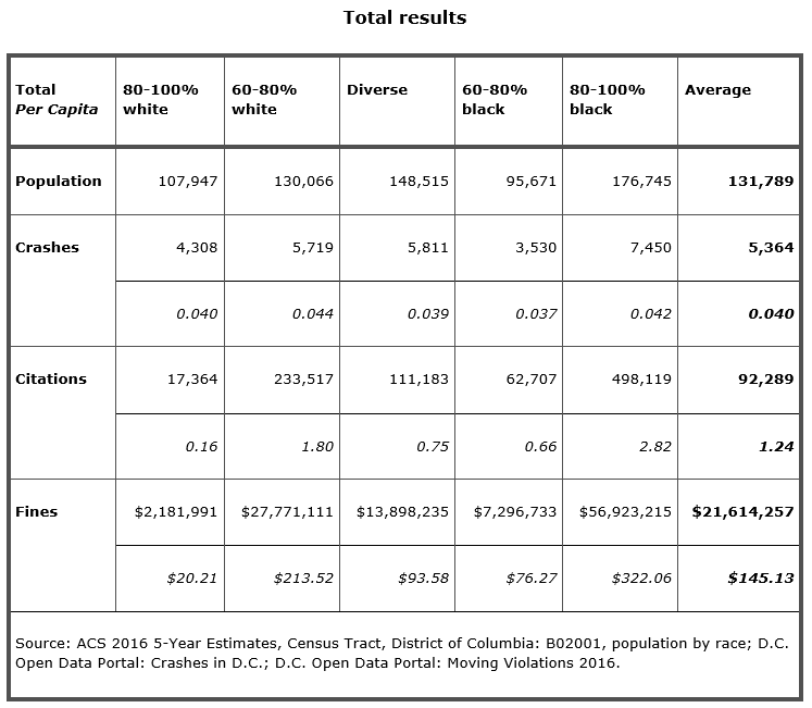
Once settling on this dataset, I used a vector analysis tool in QGIS called “sum points in polygon,” which counts the number of data points (i.e., traffic violations) within a specified geographic extent (i.e., a census tract). This resulted in a remarkably similar number of crashes per capita across the various demographic categories, which indicated to me that there was no preponderance of crashes in one tract type versus another that would explain the difference in moving violations. It should be noted however that analyzing crashes at this high level, rather than at the intersection or corridor level, will not yield information about the effectiveness of individual cameras at curbing dangerous driving behavior. It only tells us that on average, crashes in predominantly black areas are no more or less prevalent than crashes in predominantly white areas.
I also checked lane-mileage within the census tract as a proxy for traffic volume under the assumption that all tracts would have roughly the same proportion of major to local streets and each street type should carry about the same number of vehicles, when averaged over the entire tract. Finally, I thought it was reasonable that the lane mileage would be proportional to the population in that tract. I performed this by using the vector analysis tool “sum line lengths” in QGIS, which returns the sum of line lengths (streets) falling within each polygon (census tract). From this, I learned that that lane mileage per capita in each tract was similar enough across the demographic categories that differences in traffic volume wouldn’t substantially contribute to the large differences in moving violations observed. Due to the similarity to crashes, I chose to omit this metric from the article for clarity.
Moving violations
The crux of the thesis hinged on the geospatial analysis of moving violations. 2016 was the most recent year which had data available, but I soon learned that it was not quite as simple as that. While all months of geocoded data were posted on the DC Open Data portal, three months had errors which prevented them from loading. After alerting the technicians running the site of this problem, they replaced all 12 months with text files containing coordinates, but not geocoded. I then had to determine the coordinate system used, which was unfortunately not listed in the metadata associated with these files. Eventually, I was able to use the text file to generate the shapefile necessary to analyze the data in QGIS.
Once in QGIS, I was able to sum the number of moving violations in the same way as the number of crashes, by running the function to sum the points within each polygon. The simple quantity is an important metric because it tells us how many instances of moving violations were recorded, however the fine amount data was also available and relevant insofar as it affects the people receiving them. This was slightly more involved than the simple quantity. I did this by using the vector data management tool “join attributes by location.” From this, it is possible to define the join area as the census tract polygon and return a summary of features included in the join, including the sum of fines issued. Although both the number of fines and the sum of fine amounts were very similar, I thought it was important to include them both because each speaks to a different element of the issue.
Results and analysis
Although this data can be parsed in many ways, for this initial investigation I chose to present the results as simple quantities and per capita ratios. While the topic certainly warrants additional scrutiny, this high-level approach was appropriate for this first pass of the data.
Upon analyzing these data at the census tract level, it appears that drivers in black-segregated neighborhoods receive double the average number of moving violations per capita, while drivers within white-segregated areas receive just one eighth the average. Put differently, a driver in a black-segregated area is over 17 times more likely to receive a moving violation at a cost of 16 times more per resident than in a white-segregated area. Considering that each tract group represents a remarkably similar number of crashes per capita, this is quite an extraordinary disparity.
Total results
Although I was expecting some level of disparity between the different racial categories, I was admittedly quite shocked when I saw just severe the gap between citations in predominately white versus predominantly black neighborhoods truly was. After double-checking to ensure there no major errors causing this discrepancy, I dug deeper into whether any outlier values were behind these values.
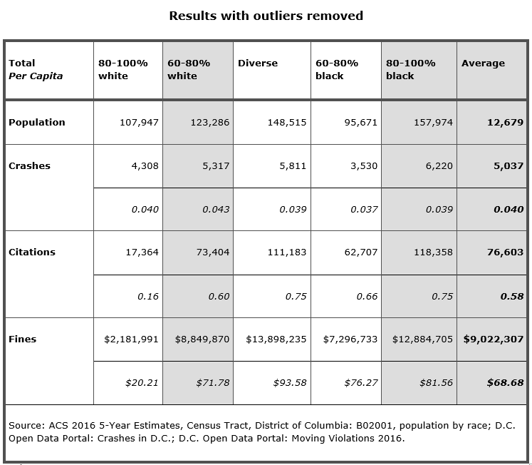
Results with outliers removed
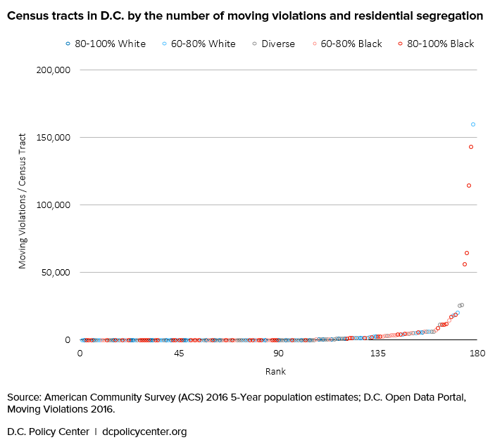
The chart below shows how the number of violations per tract begin to tail up exponentially, revealing the top five tracts with values far above the rest of the data. I then found that in each of these outlier tracts there was usually one camera in particular registering an order of magnitude more citations than normal. Since four of these tracts are located in predominantly black neighborhoods, they drove up averages for that category substantially.
Census tracts in D.C. by the number of moving violations and residential segregation
For all five outlier tracts, I checked the specific locations of the cameras on Google Street View to better understand their context. And while one of them was located on an Interstate highway, suggesting that that people living outside the census tract would be overrepresented, the rest were on urban arterial streets. Although these streets are used by many in the vicinity, it is reasonable to expect that people living within the tract are more likely to use them.
Conclusion
There are dozens of decisions that affect each step of the methodological process, and each one could alter the ultimate shape of the research. None are inherently more correct than the other, so long as they can be reasonably justified and explained. As such, the truest picture emerges when multiple researchers each apply their own nuanced approaches to analyzing this issue. In this case, all data I used are publicly available and listed below, and I encourage anyone interested to take a look for themselves to see what can be learned from it.
For this analysis, I was able to use GIS and spreadsheets to synthesize these disparate data sources into a unified picture of the inequitable distribution D.C.’s issuance of traffic citations, which skews heavily towards predominantly black neighborhoods and away from predominantly white neighborhoods. It is my hope that investigations like this can inform DDOT and MPD policy so that they can affirmatively consider equity in camera placement in order to ensure that the punitive components of combatting traffic violence do not contribute further to existing racial and wealth inequality.
About the data
Data sources:
- Demographic data: ACS 2016 5-Year Estimates, Census Tract, District of Columbia: B02001, population by race
- Crash data: D.C. Open Data Portal: Crashes in D.C.
- Moving violations: D.C. Open Data Portal: Moving Violations 2016
Original article: Predominately black neighborhoods in D.C. bear the brunt of automated traffic enforcement
Footnotes
[1] One Census Tract was not considered for analysis due to a population lower than the estimate’s margin of error.
William Farrell is a Transportation Engineer living in Brooklyn, NY. He received his Bachelor and Master of Engineering degrees from McGill University in Montreal, QC, for civil and transportation engineering, respectively. He now works for a civil engineering consulting firm in New York, NY and sits on the Advisory Board of the Tri-State Transportation Campaign. He blogs at transpophile.com and tweets at @wjfarr.


